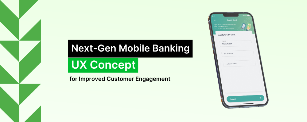
Passionate about simplifying Fintech solutions, we at our UX Labs have been conceptualizing about improving engagement and experience in Mobile Banking Applications
Mobile banking is the most convenient way to manage finances on the go. So, it is natural that the users expect a seamless app experience with easy-to-use features and functionalities for effortless money management. In the due process of “engineering experience” for some of the top financial institutions worldwide, we identified some existing experience gaps and aimed to address them via this concept.
Our vision is to provide a Digital Banking experience that meets customer expectations and offers personalised nudges for better engagement.
Research-led discovery
We believe in extensive UX research to validate our ideas. Our research is based on empathy for the users and understanding their behaviour. We collect data based on our observation of how the users interact with their banking app, so we can analyse the data and correlate it with the trends.
The different phases of our research include the following:
Persona Analysis
First, understanding the target personas – Based on our research, we identified two groups of digital-savvy millennial users with different needs and desires who will use the app most frequently for all their banking transactions. These two groups are the Planner and the Go-Getter. Identifying the target personas, we studied their behaviour on the existing applications, typical features they regularly use, and their expectations from the app from our understanding.
Second, collecting data and insights based on user interviews – Identifying our target personas led us to the next phase of research: conducting user interviews to speak with the participants and learn about their experience, including their wants/desires and frustrations.
Here are some of the frustrations as well as expectations of the users based on our user interviews:
Frustrations of the Go-Getter –
- The interface is not minimalistic and easy to use
- Missing billing payments schedule regularly
- Transferring funds seems a difficult task
- Ads or offerings are not related
Expectations/Desire of the Go-Getter from the App –
- Remind /notify my bill payment
- Transfer funds easily and manage accounts in one place
- Want only to see ads/offerings related
Frustrations of the Planner –
- Less discoverability across app features and offers/coupons
- Transferring funds seems a difficult task with more prominence to traditional transfer methods
- Payments are not possible to other bank cards
Expectations/Desire of the Planner from the App –
- Help in saving money
- The application should be intuitive to help achieve goals
- An app that helps with all financial needs
Ecosystem Analysis
As they say, no research can be complete without deep understanding and analysis of the ecosystem,. Our extensive analysis on the existing Mobile Banking Applications made us realise that most mobile solutions/apps provide a lot of functionalities. However, whether the users want those functionalities or can use them efficiently is a big question.
We identified that most digital banking applications provide the following:
- Multiple features that might not be relevant – In a rush to make customers happy, many banking apps load it with too many features which the user might not appreciate, such as a shopping/travel link. Instead, providing cleared cheque screenshots might put customers’ minds at peace.
- Check account balance – Almost all banking apps provide customers with the essential facility to check their savings accounts. However, hardly any app provides personalised advice based on the account balance.
- Do payment transactions – A banking app will only be complete by providing the functionality of making payment transactions. However, in many cases, the options of the transaction medium are limited.
- Account-to-account transfers – Most banking apps now provide the facility to make fund transfers possible between internal accounts. However, not all apps offer the facility to do a person-to-person transfer or the same feature is not easily discoverable.
- Check trading accounts – Though all banks might not offer this feature, some banking apps nowadays provide the functionality to check trading accounts. However, in most cases it might not be within the same interface to make it simple for the users.
- Make investments – With banks making various investment products, most banking apps provide the option to make investments within the app. However, hardly any app provides personalised recommendations per the customer spending and saving behaviour. After all, in banking, it can barely be “one size fits all”.
UX Conceptualization Methodology
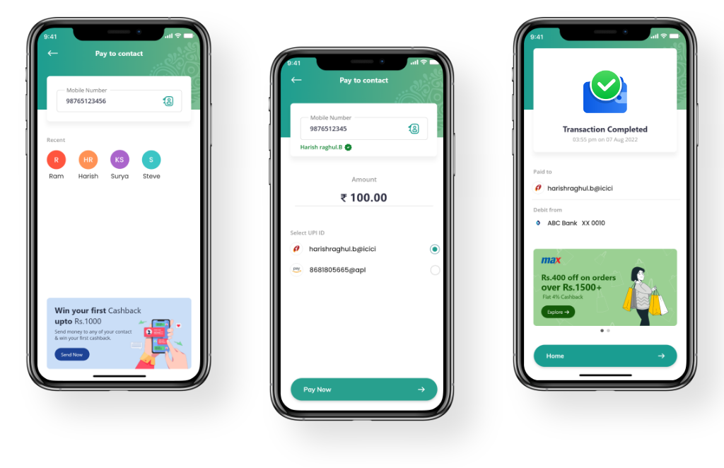
After a lot of analysis and brainstorming, a UX concept emerged to bridge the existing gap in banking apps. After carefully collating all our findings and observations, we mapped out a conceptual flow and information architecture covering all the details of every user interaction point. The following are a few research-based methodologies we adopted for the concept:
- Prioritising features and content (Information Architecture) – A co-existing hierarchy model (Information architecture technique) is considered. It will allow users to access the content in various ways they want. However, the AI-based system will still guide them along the path to ensure they take the expected actions.
- Sort menus/Card sorting – Provide users with an open card sorting functionality that will enable them to group content based on its relativity of use and name the group they want. It is applied to the menus to ensure clarity in understanding the names/titles and sub-menus.
The conceptual map of the app prioritised the following essential functionalities:
- Prioritised payment interface
- Spend analysis
- Payment reminders/alerts/notifications and nudges
Key Considerations For Engagement Improvisation
Here are some of the crucial factors we considered before planning the UX that will be personalised to deliver the best possible experience:
- We analyse user behaviour, conceptualise and then design UX as a methodology and not a package or just another part of the app
- Always ensure that customers and their experience are at the centre of all business processes
- Ensure that the app is scalable to adjust per customer needs and digital advancements
- The customer base growth depends on removing absolute practices
- The app should provide a holistic ecosystem to make it easy for the users
- Unique solutions should reflect unique emotions; thus, we focus on user emotions instead of technology or just passing information.
- Super apps design instead of a mono-functional app
- Introducing rewards and gamification to keep users happy and motivated
- Adopt optimised user flow to make navigation easy to encourage daily usage
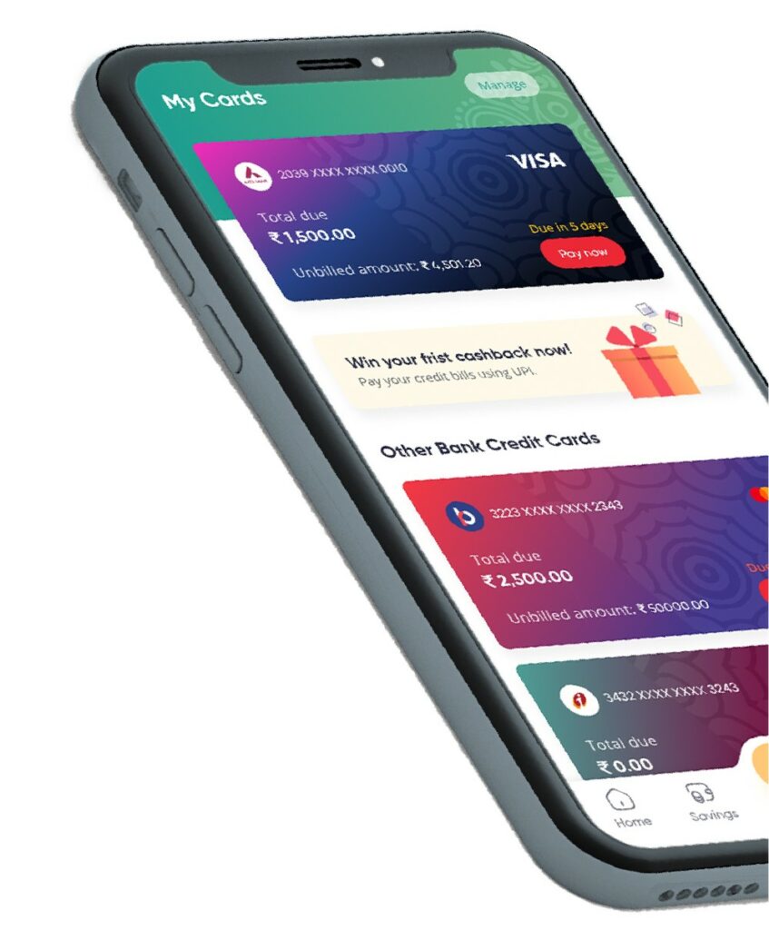
Proof Of Concept – Motion Prototypes
Set to redefine banking app UX, we anticipate the following positive outcomes from the concept:
Make payments simpler
Multiple payment options to make the process more user-friendly instead of restraining them to limited choice.
Increased engagement
Presenting relevant content and nudges with rewards/vouchers to engage the users with the app.
Improve financial discipline
As millennials consider income disposable, the app can be equipped to deliver valuable tips to help them develop smart saving habit.
Holistic ecosystem
Mobile banking apps should work as a “one-stop” solution to encourage customers to use them for all banking-related activities.
Personalisation Driven
In-app ads will be relevant to the user behaviour, so they can discover other products/features which might be helpful for them.
With deep industry expertise and known for engineering experience, we at Market Simplified design apps with a unique approach, blending science and creativity. If this concept inspires you to redefine the user experience of your mobile banking app to increase customer satisfaction and engagement, then we would like to chat with you – Market Simplified.
;)

